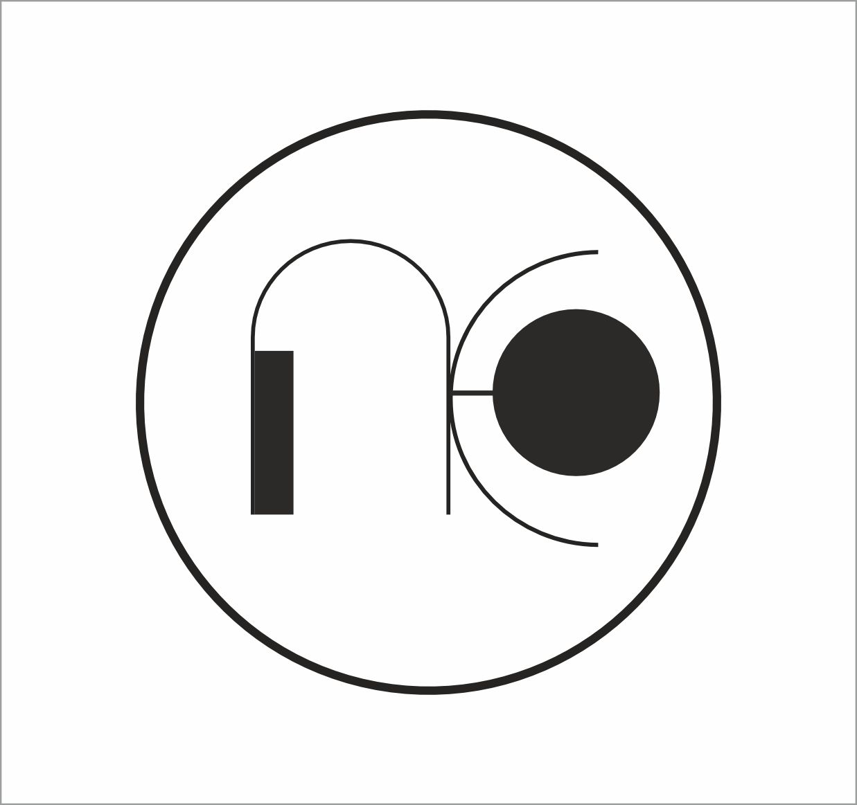
Philosophy Of This Logo
The identity of ONCE Associates is built on simplicity, precision, and structural balance. The circular form represents unity and completeness, while the clean linear typography reflects architectural clarity and modern design thinking.
Circle
Unity &
Foudation
Lines
Structure &
Planning

Space
Balance &
Breating Space
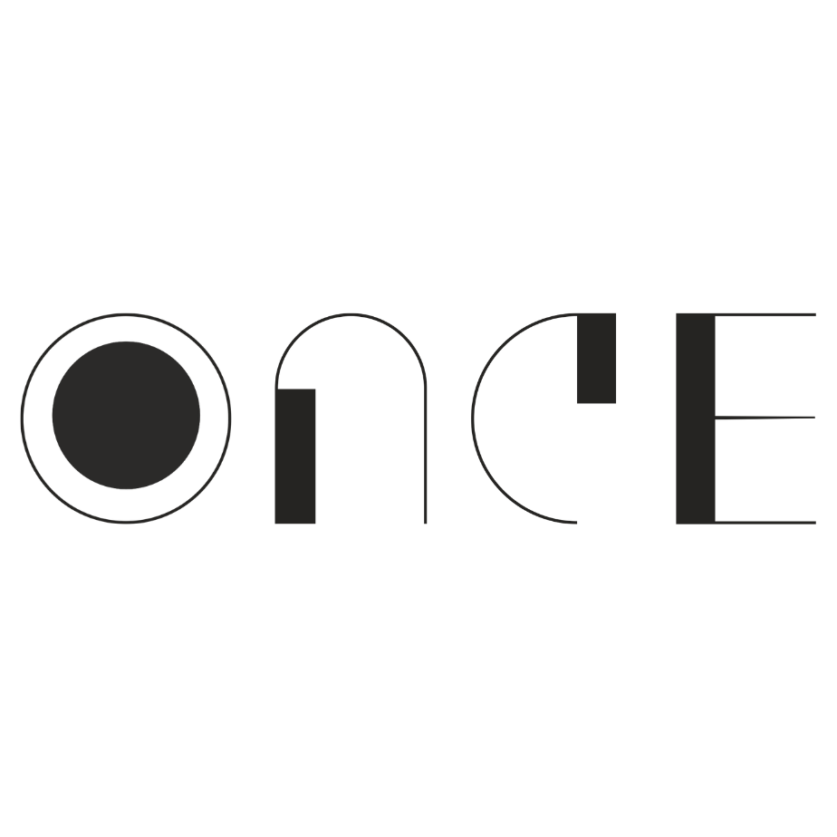
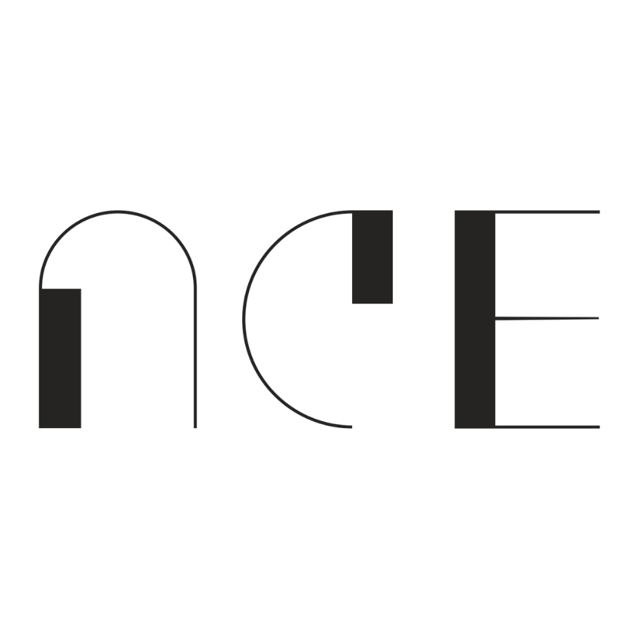
Typography
Modern
Professionalism
Color Pallete
#1A1A1A
Charcoal Black
#7A7A7A
Mid Grey
#EDEDED
Soft Grey
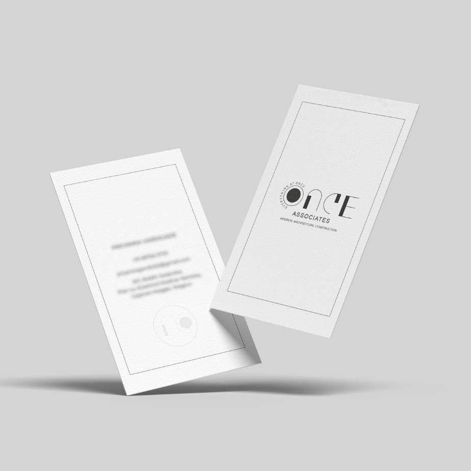
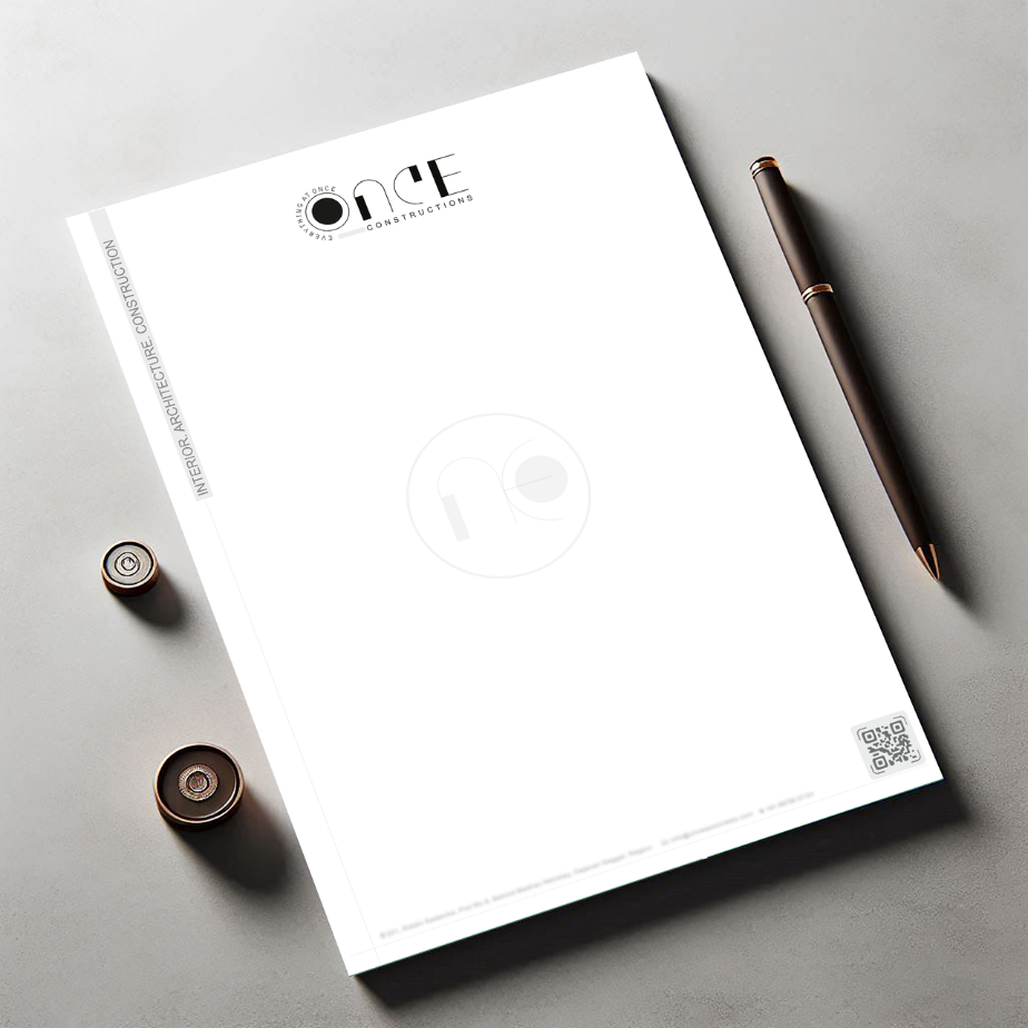
Mockups
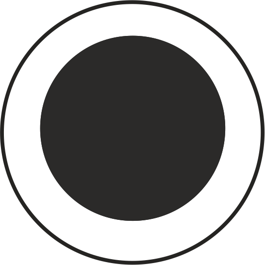
Favicon