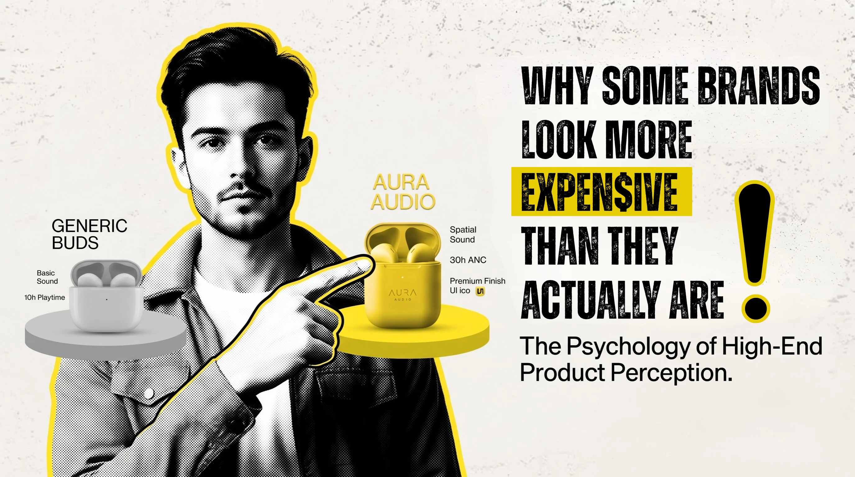
Have you ever looked at two products that were almost identical and thought,
“This one looks expensive.”
Maybe it was a bottle of skincare. A packet of coffee. A restaurant menu. A piece of furniture. Or even a website.
You might not have known anything about the company behind it. You might not have known how much it cost to make. You might not even have known whether it was actually better than the cheaper-looking option.
But somehow, one of them felt more valuable.
That's the interesting thing about brands.
We don't experience a brand only through the product. We experience it through everything around the product.
The colours. The photographs. The packaging. The website. The words. The way information is presented. Even the amount of empty space in a design.
And sometimes, those little things can make a ₹500 product feel like a ₹1,000 product.
Not because the brand is trying to fool you.
Simply because the brand has done a better job of communicating value.
Think about a restaurant for a moment
Imagine two restaurants serving roughly the same kind of food.
The first has a menu with seven different fonts, random food photographs, bright colours everywhere, and text packed into every available space.
The second has a simple menu. Good photographs. Consistent colours. Clear descriptions. Enough space between items. Everything looks like it belongs together.
Which one would you expect to be more expensive? Most people would probably expect the second one to cost more.
But here's the interesting part:
We haven't tasted the food yet.
We haven't seen the kitchen.
We don't know which chef is better.
We don't know which restaurant spends more on ingredients.
We've simply seen the presentation. That's how powerful perception can be.
Your first impression happens before you get a chance to explain yourself
A customer might discover your business through Instagram Or Google. Or your website. Or a WhatsApp message. Or a product package sitting on a store shelf.
Before you get the opportunity to tell them how experienced you are, how good your product is, or how much effort goes into your work, they've already seen something. And they've already formed an impression. That's why good design isn't just decoration. It's communication. A clean, well-thought-out design can quietly say:
“We pay attention to details.”
A confusing or inconsistent design can unintentionally say the opposite. And neither message requires a single word to be written.
It's not always about making things look fancy
There's a common misunderstanding about premium branding.People often think:
Premium = gold + black + fancy fonts.
Not really.
A brand can look premium using bright colours. It can look premium using simple typography. It can look premium using earthy tones. What matters more is whether the choices feel intentional.
For example, imagine a food brand.
If its packaging uses ten colours, three different fonts, multiple badges, five claims, and several graphics fighting for attention, the customer doesn't know where to look.
Now imagine the same product with a clear logo, one strong photograph, a simple colour palette, readable information, and enough breathing room.
The second design doesn't necessarily have more information. It simply makes the information easier to understand. And that can make a huge difference.
Sometimes, saying less makes a brand feel more confident
Look at the way some established brands communicate.
They don't always shout.
They don't need five exclamation marks after every sentence.
They don't put every possible selling point on the same poster.
They might simply show the product and give you one strong reason to care.
There's something confident about that.
Think about a salesperson who keeps telling you:
"Best quality! Best price! Don't miss this! Limited offer! Buy now!"
Now think about someone who understands the product well enough to simply explain why it is useful. The second person often feels more trustworthy. The same thing happens with design.
A brand doesn't have to fill every inch of space to prove that it has something valuable to offer.
And then there's photography
This is one of the easiest things to notice.
- Take an ordinary product.
- Put it on a messy table.
- Take a quick photograph under whatever light happens to be available.
The product may look… ordinary.
- Now take the exact same product.
- Think about the background.
- Think about the lighting.
- Think about the angle.
- Add a little context.
- Make sure the product is clean and properly positioned.
Suddenly, it looks different. The product didn't change.
The photograph changed the way we see the product.
This matters even more online. When someone is shopping online, they can't pick up your product. They can't feel the packaging. They can't look at it from different angles. Your photographs, website and content have to do some of that work for you.
Your website is saying something too
There's another place where this becomes very obvious: websites. We've all visited websites that technically have everything we need.
- The information is there.
- The contact number is there.
- The products are there.
But something just doesn't feel right.
- Maybe the pages are crowded.
- Maybe every section looks different.
- Maybe the images don't match.
- Maybe finding basic information takes too many clicks.
And then there are websites where everything feels easy. You know where to go. You understand what the company does. The images make sense. The text is easy to read. The buttons are where you expect them to be. Nothing feels unnecessarily complicated. That experience creates confidence. And confidence has value. A website doesn't need to have dozens of animations or complicated effects to look professional.
Sometimes,a simple website that works properly feels far more premium than an impressive-looking website that makes you work to find things.
Small businesses can look like big brands too
This is probably the most encouraging part.
You don't need to be a huge company to look established. A small business can have:
- A consistent colour palette
- Good product photography
- A clear logo
- A well-designed website
- Professional packaging
- Consistent social media
- Clear communication
None of these things require the business to have hundreds of employees. What matters is that they work together. Imagine seeing the same colours, typography and visual style on a company's website, Instagram page, packaging and brochure. After a while, you start recognising the brand without even reading the name. That's when branding starts doing its job.
- Maybe the pages are crowded.
- Maybe every section looks different.
- Maybe the images don't match.
- Maybe finding basic information takes too many clicks.
And then there are websites where everything feels easy. You know where to go. You understand what the company does. The images make sense. The text is easy to read. The buttons are where you expect them to be. Nothing feels unnecessarily complicated. That experience creates confidence. And confidence has value. A website doesn't need to have dozens of animations or complicated effects to look professional.
Sometimes,a simple website that works properly feels far more premium than an impressive-looking website that makes you work to find things.
Consistency is one of those things you notice without noticing
Here's a simple experiment.
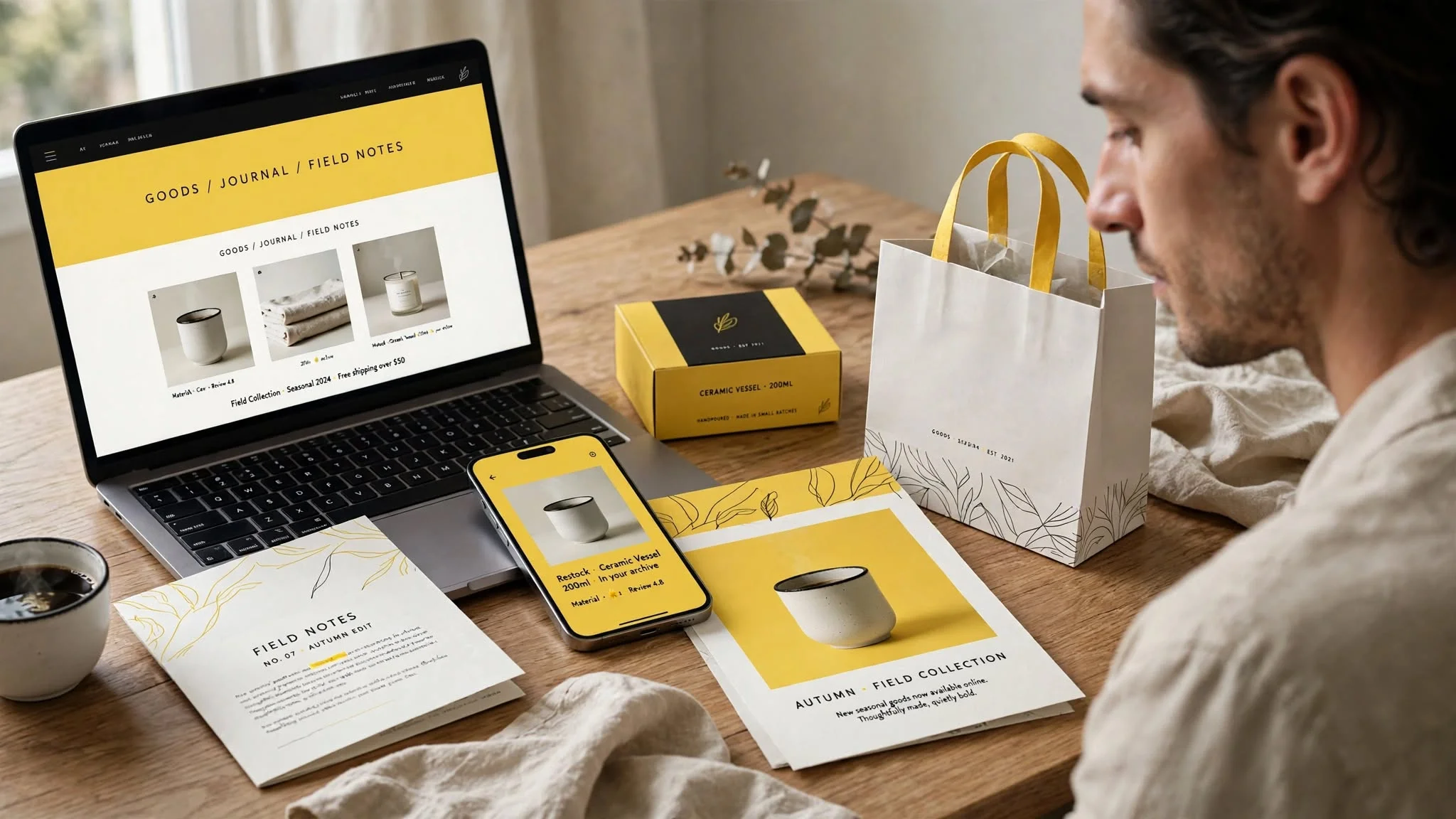
Think of a brand you recognise immediately.
You probably don't recognise it because you've memorised its logo alone.
- You recognise its colours.
- Its photography.
- Its packaging.
- Its tone.
- Its advertisements.
- The way it presents information.
All those things have trained your brain to recognise the brand.
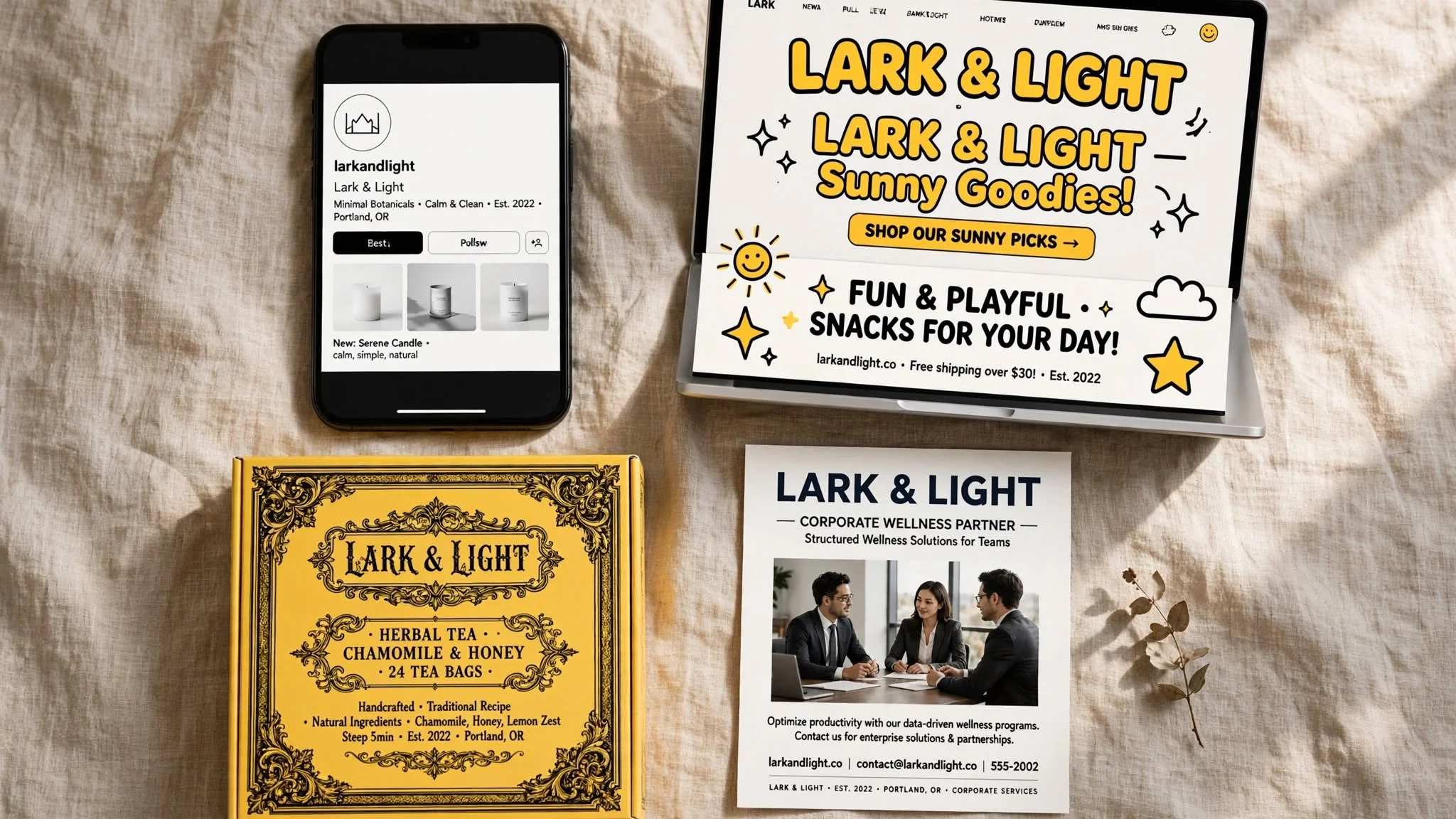
Now imagine a small business where every platform looks different.
- The Instagram page has one style.
- The website has another.
- The packaging has another.
- The advertisements look completely unrelated.
Even if the business itself is excellent, it becomes harder to remember.
Consistency makes a business feel more established because it gives the customer something familiar to hold on to.
The same thing applies to words
Design gets most of the attention when we talk about branding, but words matter just as much.
Compare these two messages:
“We provide high-quality products at affordable prices.”
There's nothing wrong with it.
But it's something almost every business could say.
Now imagine a brand saying: “Made for everyday moments.”
It's shorter. It doesn't explain everything.
But it gives you a feeling.
The right words depend on the brand, of course. A financial company shouldn't sound like a coffee shop, and a children's brand shouldn't sound like a law firm. The point isn't to make every brand sound sophisticated. It's to make the brand sound like itself.
So, are these brands actually better?
Not necessarily.
And that's an important distinction.
A beautiful package doesn't automatically mean the product inside is better. A fantastic website doesn't guarantee a better service. A premium-looking restaurant can still serve average food. Branding can't replace quality. What good branding "can" do is make sure the quality that's already there doesn't get overlooked.
If you've built a genuinely good product but present it poorly, people may never give it a chance. If you've built a great service but your online presence looks careless, potential customers may hesitate before contacting you. Your branding is the bridge between what your business is and what people think your business is.
The real secret isn't making your brand look expensive
It's making your brand look intentional.
That's the difference.
- Why did you choose that colour?
- Why that photograph?
- Why that font?
- Why is this information here?
- Why is that information not here?
- Why does your website look this way?
- Why does your packaging feel the way it does?
When there is a reason behind those decisions, the brand starts to feel cohesive. And when everything feels cohesive, people tend to trust it more.
So, the next time you see a brand that somehow looks more expensive than you expected, don't just look at the logo.
- Look closer.
- Look at the spacing.
- Look at the photographs.
- Look at the colours.
- Look at the words.
- Look at the website.
- Look at how consistently everything comes together.
You'll probably find that the "expensive" feeling isn't coming from one big design trick. It's coming from dozens of small decisions that were made carefully. And that's really what good branding does.
It doesn't necessarily make a business more expensive.
It makes the value of the business easier to see.